
SAS Visual Analytics
Now everyone can easily discover and share powerful insights that inspire action with a single application for reporting, data exploration and analytics.

-

See the big picture – and underlying connections
Quickly spot important relationships in your data using suggestions and clearly identified related measures. Use machine learning and natural language explanations to find, visualize and narrate stories and insights that are easy to understand and explain. Find out why something happened, examine all options and uncover opportunities hidden deep in your data. Automatically highlight key relationships, outliers, clusters and more to reveal vital insights that inspire action.
-

Turn seeing into understanding with dynamic visuals
Create stunning interactive reports and dashboards. Quickly summarize key performance metrics and share them via the web and mobile devices. Executives and front-line staff can quickly interact with and collaborate on insights, slice and dice them to find their own answers, and better understand business performance.
-

Get answers backed by data, results driven by insight
Easy-to-use predictive analytics enables even business analysts to assess possible outcomes and make smarter, data-driven decisions – no programming required. Smart algorithms reduce the need for manual experimentation. And you can work collaboratively with experts to focus on what’s most relevant.
-

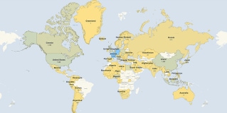
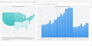
Add the 'where' to the 'what'
Add geographical context to your analyses and visualizations by combining traditional data with location data. Location analysis brings the “where” dimension to the forefront so you can analyze data in new ways to get the full picture before making decisions while identifying location-specific opportunities.
-

Leverage the best of both platforms
Use Microsoft productivity tools from Microsoft 365 for seamless access to analytics from SAS. Drill down into your data, access and interact with reports in SAS Visual Analytics and embed insights in your Microsoft applications like Excel and Outlook. Then share them with your closest collaborators.


Key features
Interactive reporting. Visual discovery. Self-service analytics. Scalability and governance. All from a single, powerful in-memory environment.
Embedded insights
Embed individual visual insights from SAS Visual Analytics reports, build interactive stories or embed the whole interactive report or page into your custom web applications. Publish your insights that scale with the flexibility of live data or embedded data snapshots for data storytelling.
SAS Visual Analytics Apps for mobile devices
Use native mobile apps for iOS and Android to view and interact with others through dynamic reports and dashboards on tablets and smartphones.
Language Support
Languages supported include Japanese, Korean, Simplified Chinese, Traditional Chinese, Thai, German, Spanish, French, Italian, Polish, Russian, Arabic, Czech, Danish, English, Greek, Croatian, Hungarian, Hebrew, Norwegian Bokmal, Dutch, Norwegian, Brazilian Portuguese, Portuguese, Slovak, Slovene, Serbian, Swedish and Turkish.

See SAS Visual Analytics in action in interactive demos
Discover how quickly and easily you can explore and understand data to resolve various industry and business issues.
-
 PUBLIC HEALTH
Emerging Disease Surveillance & ForecastingCreate an automated, insightful and transparent surveillance program for use in detecting new disease activity and tracking seasonal diseases.
PUBLIC HEALTH
Emerging Disease Surveillance & ForecastingCreate an automated, insightful and transparent surveillance program for use in detecting new disease activity and tracking seasonal diseases.
-
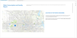 UTILITIES
Water Consumption & QualityMonitor the quality and consumption of this critical natural resource.
UTILITIES
Water Consumption & QualityMonitor the quality and consumption of this critical natural resource.
-
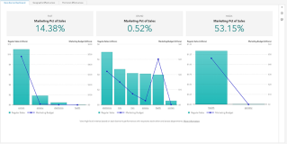 RETAIL & CONSUMER GOODS
Retail InsightsAnalyze regional store performance, and make data-driven decisions about retail business functions.
RETAIL & CONSUMER GOODS
Retail InsightsAnalyze regional store performance, and make data-driven decisions about retail business functions.
-
 MANUFACTURING
Warranty AnalysisAnalyze warranty claims to quickly identify potential issues and their underlying causes.
MANUFACTURING
Warranty AnalysisAnalyze warranty claims to quickly identify potential issues and their underlying causes.
-
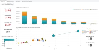
 BANKING
Banking & Risk InsightsGet a holistic view of risk and performance across regions, down to the individual counterparty level.
BANKING
Banking & Risk InsightsGet a holistic view of risk and performance across regions, down to the individual counterparty level.

SAS Viya is cloud-native and cloud-agnostic
Consume SAS how you want – SAS managed or self-managed. And where you want.


Recommended resources on SAS Visual Analytics
To browse resources by type, select an option below.
-
- Select resource type
- Analyst Report
- Article
- Blog Post
- Book Excerpt
- Case Study
- Customer Story
- E-Book
- Infographic
- Interview
- Research
- Series
- Video
- Webinar
- White Paper
-
 Customer Story
Delivering new levels of transparency and equity in carbon market transactions
Customer Story
Delivering new levels of transparency and equity in carbon market transactions -
 Webinar
SAS Viya Copilot in Visual Analytics
Webinar
SAS Viya Copilot in Visual Analytics -
 Customer Story
Improving data collection and modeling to accelerate predictive medicine efforts
Customer Story
Improving data collection and modeling to accelerate predictive medicine efforts -
 Customer Story
Ensuring public transparency and one-stop access to crime data and analysis
Customer Story
Ensuring public transparency and one-stop access to crime data and analysis -
 Customer Story
AI and cloud fuel bank’s new era of fast, reliable credit risk reporting
Customer Story
AI and cloud fuel bank’s new era of fast, reliable credit risk reporting -
 Customer Story
One airport operator is making every journey personal for passengers
Customer Story
One airport operator is making every journey personal for passengers -
 Customer Story
Self-service analytics advances higher education
Customer Story
Self-service analytics advances higher education -
 Customer Story
Streamlining financial management with advanced analytics
Customer Story
Streamlining financial management with advanced analytics -
 Customer Story
Strengthening information security and governance with unified risk management
Customer Story
Strengthening information security and governance with unified risk management -
 Customer Story
Predictive analytics and AI deliver a winning fan experience
Customer Story
Predictive analytics and AI deliver a winning fan experience -
 Customer Story
Automating credit decisions for a digital-first future
Customer Story
Automating credit decisions for a digital-first future -
 E-Book
Decisions you can trust: A strategic guide to trustworthy data and AI decision making
E-Book
Decisions you can trust: A strategic guide to trustworthy data and AI decision making -
 Blog Post
How SAS Viya ensures successful, sustainable model deployments
Blog Post
How SAS Viya ensures successful, sustainable model deployments -
 Customer Story
It’s all in the research: Using AI to solve issues in health care
Customer Story
It’s all in the research: Using AI to solve issues in health care -
 Customer Story
Accelerating drug discovery with AI innovation
Customer Story
Accelerating drug discovery with AI innovation -
 Customer Story
Managing Dutch roads and waterways with intelligence
Customer Story
Managing Dutch roads and waterways with intelligence -
 Customer Story
Finland’s top retail bank applies AI to improve customer service and credit scoring
Customer Story
Finland’s top retail bank applies AI to improve customer service and credit scoring -
 Customer Story
Jakarta Smart City uses IoT analytics to better serve residents
Customer Story
Jakarta Smart City uses IoT analytics to better serve residents -
 Customer Story
Transforming the consumer banking experience through advanced analytics
Customer Story
Transforming the consumer banking experience through advanced analytics -
 Customer Story
Transforming logistics and package delivery with data and AI
Customer Story
Transforming logistics and package delivery with data and AI -
 Customer Story
Hospitals save time and money with real-time medical device tracking
Customer Story
Hospitals save time and money with real-time medical device tracking -
 Customer Story
Enhancing credit management with data and analytics
Customer Story
Enhancing credit management with data and analytics -
 Customer Story
Getting more people behind the wheel with predictive modeling and personalized financing solutions
Customer Story
Getting more people behind the wheel with predictive modeling and personalized financing solutions -
 Customer Story
Integrating data, generative AI and human expertise to tackle global warming
Customer Story
Integrating data, generative AI and human expertise to tackle global warming -
 Customer Story
Analytics helps ensure fair and balanced pay structures across Sweden’s public sector
Customer Story
Analytics helps ensure fair and balanced pay structures across Sweden’s public sector -
 Webinar
How To Accelerate Governed Decision Delivery With SAS ID Workflows
Webinar
How To Accelerate Governed Decision Delivery With SAS ID Workflows -
 Webinar
Easily Turn Your Automated Explanation Into a Predictive Model
Webinar
Easily Turn Your Automated Explanation Into a Predictive Model -
 Webinar
Report Design in Action – Applying Report Design Best Practices
Webinar
Report Design in Action – Applying Report Design Best Practices -
 Customer Story
AI helps students graduate from college
Customer Story
AI helps students graduate from college -
 E-Book
Government navigating an uncertain world
E-Book
Government navigating an uncertain world -
 Customer Story
Award-winning bank’s data-driven strategy boosts productivity, efficiency and customer centricity
Customer Story
Award-winning bank’s data-driven strategy boosts productivity, efficiency and customer centricity -
 Webinar
Using Templates to Create Reports Quickly in SAS Visual Analytics
Webinar
Using Templates to Create Reports Quickly in SAS Visual Analytics -
 Customer Story
Analytic models spotlight risky loans
Customer Story
Analytic models spotlight risky loans -
 Customer Story
 & Video
Advanced analytics helps policymakers determine how new tax measures would affect citizens
Customer Story
Customer Story & Video
Advanced analytics helps policymakers determine how new tax measures would affect citizens -
 Customer Story
Enhancing road safety with advanced analytics
Customer Story
Enhancing road safety with advanced analytics -
 Customer Story
Automated safety reporting protects hospital patients in Norway
Customer Story
Automated safety reporting protects hospital patients in Norway -
 Customer Story
Optimizing cancer patient care with advanced analytics
Customer Story
Optimizing cancer patient care with advanced analytics -
 Customer Story
Taking the guesswork out of production planning
Customer Story
Taking the guesswork out of production planning -
 Customer Story
Analytics helps major public health system run efficient programs and improve patient care
Customer Story
Analytics helps major public health system run efficient programs and improve patient care -
 Customer Story
Smart data exploration advances K-12 public education programs
Customer Story
Smart data exploration advances K-12 public education programs -
 White Paper
Tar Heels Play to Win With SAS Analytics
White Paper
Tar Heels Play to Win With SAS Analytics -
 White Paper
Redefine Your Analytics Journey With Interactive Data Exploration and Predictive Analytics
White Paper
Redefine Your Analytics Journey With Interactive Data Exploration and Predictive Analytics -
 White Paper
The Power of Collaboration
White Paper
The Power of Collaboration -
 White Paper
TDWI Checklist Report: Gaining Business Value from Governed Analytics and Discovery
White Paper
TDWI Checklist Report: Gaining Business Value from Governed Analytics and Discovery -
 White Paper
The Use of Open Source is Growing. So Why Do Organizations Still Turn to SAS?
White Paper
The Use of Open Source is Growing. So Why Do Organizations Still Turn to SAS? -
 Webinar
How Can I Create Custom Geo Maps in SAS® Visual Analytics?
Webinar
How Can I Create Custom Geo Maps in SAS® Visual Analytics? -
 Webinar
SAS® Visual Analytics Stories Are Data With a Soul
Webinar
SAS® Visual Analytics Stories Are Data With a Soul -
 Customer Story
One of the largest multi-sport clubs in Portugal aims to win big with analytics
Customer Story
One of the largest multi-sport clubs in Portugal aims to win big with analytics -
 White Paper
Fast and Furious
White Paper
Fast and Furious -
 Article
Location intelligence: Adding geospatial context to BI
Article
Location intelligence: Adding geospatial context to BI -
 Interview
Location analytics: Why adding where makes BI better
Interview
Location analytics: Why adding where makes BI better -
 White Paper
Data Visualization Techniques
White Paper
Data Visualization Techniques -
 White Paper
Workforce Analytics
White Paper
Workforce Analytics -
 Customer Story
University uses analytics to ensure student success
Customer Story
University uses analytics to ensure student success -
 Webinar
Take Your SAS® Visualizations to the Next Level
Webinar
Take Your SAS® Visualizations to the Next Level -
 Webinar
How Do I Get the Most From AI-Enhanced BI With SAS Visual Analytics for SAS Viya?
Webinar
How Do I Get the Most From AI-Enhanced BI With SAS Visual Analytics for SAS Viya? -
 Webinar
How Do I Prepare My SAS Visual Analytics Deployment on SAS 9 for Adobe Flash End of Life?
Webinar
How Do I Prepare My SAS Visual Analytics Deployment on SAS 9 for Adobe Flash End of Life? -
 Webinar
How Can I Visualize Global COVID-19 Survey Data?
Webinar
How Can I Visualize Global COVID-19 Survey Data? -
 Webinar
Getting Started With Geo Analysis in SAS® Visual Analytics
Webinar
Getting Started With Geo Analysis in SAS® Visual Analytics -
 E-Book
Augmented Analytics: The secret ingredient to better business intelligence
E-Book
Augmented Analytics: The secret ingredient to better business intelligence -
 White Paper
Building an Analytical Culture for Success
White Paper
Building an Analytical Culture for Success -
 Customer Story
Boosting institutional research with data governance and self-service reporting
Customer Story
Boosting institutional research with data governance and self-service reporting -
 Article
Are you good at scoring?
Article
Are you good at scoring? -
 Customer Story
Better reporting yields better understanding of risk management
Customer Story
Better reporting yields better understanding of risk management -
 Customer Story
Italy’s second-largest hospital uses advanced analytics for effective pandemic response
Customer Story
Italy’s second-largest hospital uses advanced analytics for effective pandemic response -
 Customer Story
Real-time analytics helps telecom provider adapt to changing customer needs during global pandemic and beyond
Customer Story
Real-time analytics helps telecom provider adapt to changing customer needs during global pandemic and beyond -
 Customer Story
Automated laboratories improve uptime with analytics
Customer Story
Automated laboratories improve uptime with analytics -
 Customer Story
A model of institutional research champions the value of analytics for all
Customer Story
A model of institutional research champions the value of analytics for all -
 Webinar
SAS Visual Statistics on Viya: Getting Started
Webinar
SAS Visual Statistics on Viya: Getting Started -
 Webinar
SAS Visual Analytics on SAS Viya: Getting Started
Webinar
SAS Visual Analytics on SAS Viya: Getting Started -
 Webinar
Dashboarding in SAS Visual Analytics with Data Science in Mind
Webinar
Dashboarding in SAS Visual Analytics with Data Science in Mind -
 Webinar
What Does It Mean to Administer SAS Visual Analytics?
Webinar
What Does It Mean to Administer SAS Visual Analytics? -
 Customer Story
Travel and tourism forecasts become more accurate with analytics
Customer Story
Travel and tourism forecasts become more accurate with analytics -
 Customer Story
Forecasting accuracy brings ‘new energy’ to Cameroon
Customer Story
Forecasting accuracy brings ‘new energy’ to Cameroon -
 Article
From living on the streets to owning a profitable business
Article
From living on the streets to owning a profitable business -
 Customer Story
Hands-on analytics training prepares students for real world
Customer Story
Hands-on analytics training prepares students for real world -
 Customer Story
Property experts open analytics to new markets
Customer Story
Property experts open analytics to new markets -
 Customer Story
Valencia College uses data-driven approach to improve outcomes in higher education
Customer Story
Valencia College uses data-driven approach to improve outcomes in higher education -
 Customer Story
Improving patient care and reducing costs with visual analytics
Customer Story
Improving patient care and reducing costs with visual analytics -
 Customer Story
Achieving academic and operational excellence through business intelligence
Customer Story
Achieving academic and operational excellence through business intelligence

Related products, solutions & capabilities
- SAS® for Microsoft 365Get seamless access to analytical insights by using Microsoft 365 applications alongside SAS Viya.
- SAS® Visual ForecastingGenerate large numbers of trustworthy forecasts, quickly and automatically, using time series and machine learning techniques.
- SAS® Visual InvestigatorAddress a wide variety of intelligence analysis and investigation management needs with speed and precision.