Data Visualisation
What it is and why it matters
Data visualisation is the presentation of data in a pictorial or graphical format. It enables decision makers to see analytics presented visually, so they can grasp difficult concepts or identify new patterns. With interactive visualisation, you can take the concept a step further by using technology to drill down into charts and graphs for more detail, interactively changing what data you see and how it’s processed.
History of Data Visualisation
The concept of using pictures to understand data has been around for centuries, from maps and graphs in the 17th century to the invention of the pie chart in the early 1800s. Several decades later, one of the most cited examples of statistical graphics occurred when Charles Minard mapped Napoleon’s invasion of Russia. The map depicted the size of the army as well as the path of Napoleon’s retreat from Moscow – and tied that information to temperature and time scales for a more in-depth understanding of the event.
It’s technology, however, that truly lit the fire under data visualisation. Computers made it possible to process large amounts of data at lightning-fast speeds. Today, data visualisation has become a rapidly evolving blend of science and art that is certain to change the corporate landscape over the next few years.
Data visualisation: A wise investment in your big data future
With big data there’s potential for great opportunity, but many retail banks are challenged when it comes to finding value in their big data investment. For example, how can they use big data to improve customer relationships? How – and to what extent – should they invest in big data?
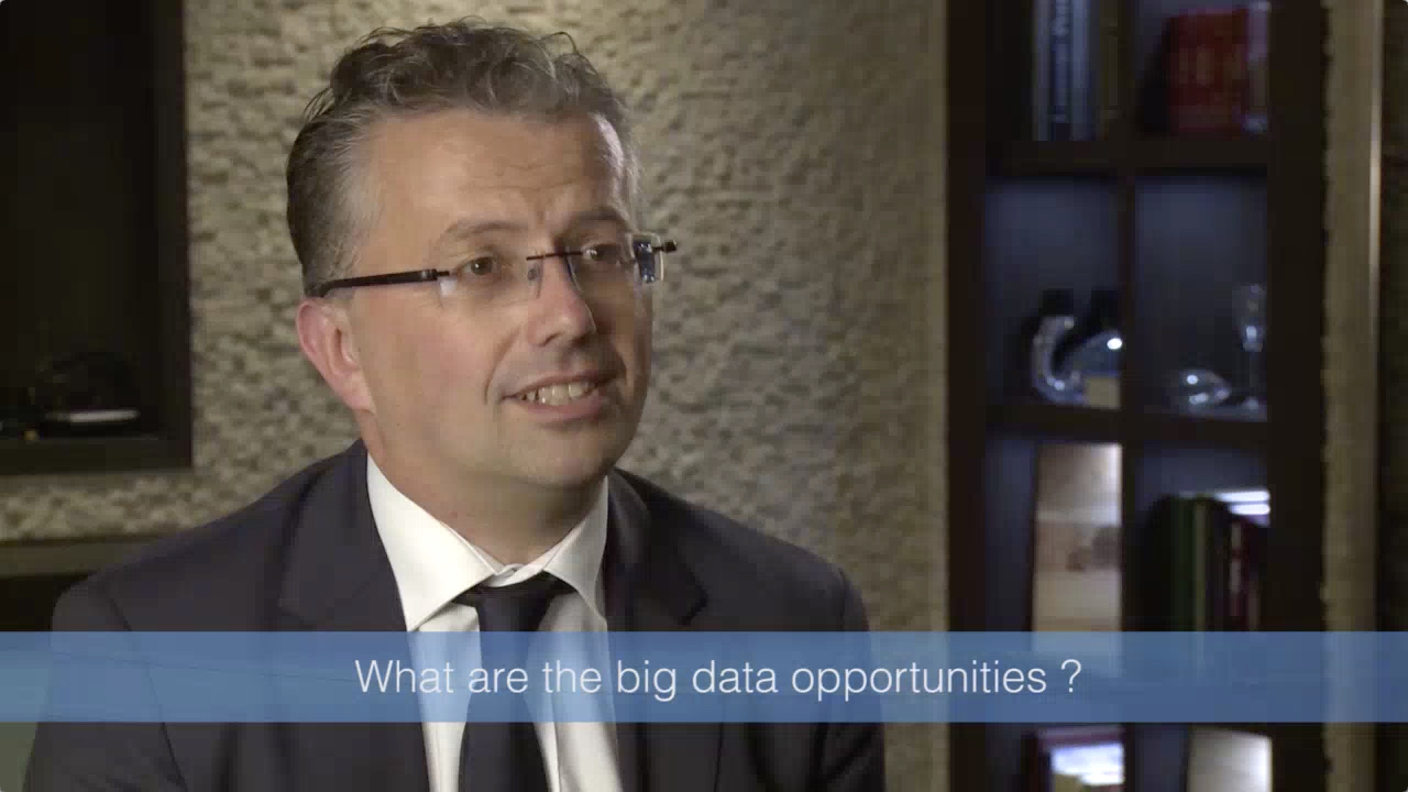
In this Q&A with Simon Samuel, Head of Customer Value Modeling for a large bank in the UK, we examine these and other big data issues that confront retail bankers.
Why is data visualization important?
Because of the way the human brain processes information, using charts or graphs to visualize large amounts of complex data is easier than poring over spreadsheets or reports. Data visualization is a quick, easy way to convey concepts in a universal manner – and you can experiment with different scenarios by making slight adjustments.
Data visualization can also:
- Identify areas that need attention or improvement.
- Clarify which factors influence customer behavior.
- Help you understand which products to place where.
- Predict sales volumes.
Why is data visualisation important?
Because of the way the human brain processes information, using charts or graphs to visualise large amounts of complex data is easier than poring over spreadsheets or reports. Data visualisation is a quick, easy way to convey concepts in a universal manner – and you can experiment with different scenarios by making slight adjustments.
Data visualisation can also:
- Identify areas that need attention or improvement.
- Clarify which factors influence customer behaviour.
- Help you understand which products to place where.
- Predict sales volumes.
Data Visualisation in Today’s World
What’s the impact that data visualisation has had in the corporate world – and what’s in store for the future? Here’s what the experts are saying.
Techniques for data visualisation
A picture is worth a thousand words – especially when you’re trying to find relationships and understand your data, which could include thousands or even millions of variables.
This white paper provides some basic tips and techniques for creating meaningful visuals of your data.
Data visualisation is going to change the way our analysts work with data. They’re going to be expected to respond to issues more rapidly. And they’ll need to be able to dig for more insights – look at data differently, more imaginatively. Data visualisation will promote that creative data exploration. Simon Samuel Head of Customer Value Modeling for a large bank in the UK
SAS® Visual Analytics
Data visualisation technology from SAS delivers fast answers to complex questions, regardless of the size of your data.
How is it being used?
Regardless of industry or size, all types of businesses are using data visualisation to help make sense of their data. Here’s how.
Comprehend information quickly
By using graphical representations of business information, businesses are able to see large amounts of data in clear, cohesive ways – and draw conclusions from that information. And since it’s significantly faster to analyse information in graphical format (as opposed to analysing information in spreadsheets), businesses can address problems or answer questions in a more timely manner.
Identify relationships and patterns
Even extensive amounts of complicated data start to make sense when presented graphically; businesses can recognize parameters that are highly correlated. Some of the correlations will be obvious, but others won’t. Identifying those relationships helps organizations focus on areas most likely to influence their most important goals.
Identify relationships and patterns
Even extensive amounts of complicated data start to make sense when presented graphically; businesses can recognize parameters that are highly correlated. Some of the correlations will be obvious, but others won’t. Identifying those relationships helps organisations focus on areas most likely to influence their most important goals.
Pinpoint emerging trends
Using data visualisation to discover trends – both in the business and in the market – can give businesses an edge over the competition, and ultimately affect the bottom line. It’s easy to spot outliers that affect product quality or customer churn, and address issues before they become bigger problems.
Communicate the story to others
Once a business has uncovered new insights from visual analytics, the next step is to communicate those insights to others. Using charts, graphs or other visually impactful representations of data is important in this step because it’s engaging and gets the message across quickly.
How it Works
Data visualisation in action
While it may be easy to grasp the concept that data visualisation helps you make sense of large amounts of data, it's not as easy to understand what happens next. What type of technology do you need, and how do you use it?
This practical video gives you an overview of SAS Visual Analytics and SAS Visual Statistics, demonstrating how it's possible to explore billions of rows of data in seconds, using different configurations. SAS technology helps you prepare data, create reports and graphs, discover new insights and share those visualisations with others via the Web, PDFs or mobile devices.
Laying the groundwork for data visualisation
Before implementing new technology, there are some steps you need to take. Not only do you need to have a solid grasp on your data, you also need to understand your goals, needs and audience. Preparing your organisation for data visualisation technology requires that you first:
- Understand the data you’re trying to visualise, including its size and cardinality (the uniqueness of data values in a column).
- Determine what you’re trying to visualise and what kind of information you want to communicate.
- Know your audience and understand how it processes visual information.
- Use a visual that conveys the information in the best and simplest form for your audience.
Once you've answered those initial questions about the type of data you have and the audience who'll be consuming the information, you need to prepare for the amount of data you'll be working with. Big data brings new challenges to visualization because large volumes, different varieties and varying velocities must be taken into account. Plus, data is often generated faster that it can be managed and analyzed.
There are factors you should consider, such as the cardinality of columns you’re trying to visualize. High cardinality means there’s a large percentage of unique values (e.g., bank account numbers, because each item should be unique). Low cardinality means a column of data contains a large percentage of repeat values (as might be seen in a “gender” column).
Once you've answered those initial questions about the type of data you have and the audience who'll be consuming the information, you need to prepare for the amount of data you'll be working with. Big data brings new challenges to visualisation because large volumes, different varieties and varying velocities must be taken into account. Plus, data is often generated faster that it can be managed and analysed.
There are factors you should consider, such as the cardinality of columns you’re trying to visualise. High cardinality means there’s a large percentage of unique values (e.g., bank account numbers, because each item should be unique). Low cardinality means a column of data contains a large percentage of repeat values (as might be seen in a “gender” column).
Deciding which visual is best
One of the biggest challenges for business users is deciding which visual should be used to best represent the information. SAS Visual Analytics uses intelligent autocharting to create the best possible visual based on the data that is selected.
When you’re first exploring a new data set, autocharts are especially useful because they provide a quick view of large amounts of data. This data exploration capability is helpful even to experienced statisticians as they seek to speed up the analytics lifecycle process because it eliminates the need for repeated sampling to determine which data is appropriate for each model.
Read More About This Topic
-
Intelligent policing: Data visualization helps crack down on crimeLearn how data visualization can give police real-time views of locations enriched with other data to help them make intelligent, fact-based decisions.
-
Are you good at scoring?Credit scoring is the foundation for evaluating clients who apply for a loan (or other types of exposure for the bank). It is not unusual for it to take up to 12 months to build and deploy a new credit scoring model. Reforming the process will help minimize losses, increase earnings and reduce operational risk.
-
Optimizing well placement to eliminate water poverty How data visualization is helping Water for Good bring fresh water to the Central African Republic.
-
The transformational power of evidence-based decision making in health policyState health agencies are under pressure to deliver better health outcomes while minimizing costs. Read how data and analytics are being used to confront our biggest health care challenges head on.


